 My Favourites


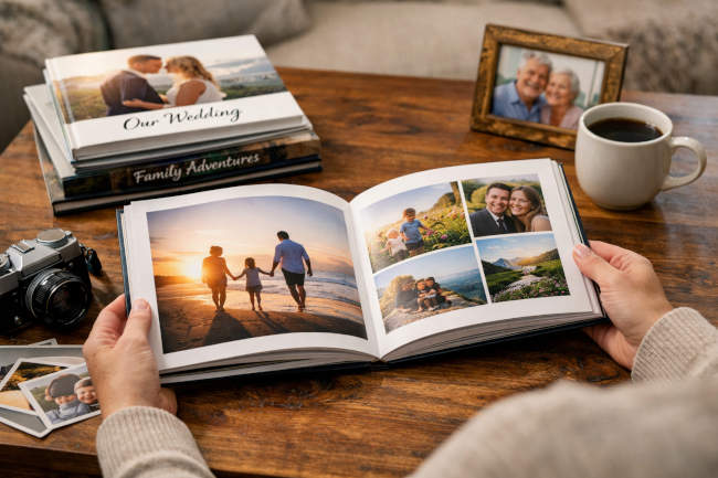
There is something genuinely irreplaceable about holding a book filled with your own memories. Unlike photos buried in a phone gallery or scattered across cloud drives, a well-crafted photo book transforms your images into a tangible story — one that can be passed down through generations. As custom photo books have grown in popularity, so has a broader recognition that physical keepsakes offer what no screen truly can: a tactile, shareable, emotionally resonant experience.
Why a Photo Book Beats Digital Storage
Digital storage carries real risks, too. Devices fail, files corrupt and subscription services quietly disappear. A printed photo book, by contrast, can last decades when handled with care. High-quality versions use archival papers and fade-resistant inks that preserve color and detail far longer than a standard inkjet print. More practically, a photo book sits on a coffee table, gets opened at family gatherings, and has a way of becoming a yearly tradition — a living artifact rather than a forgotten folder.
Define Your Photo Book’s Purpose and Theme
Before selecting a single photo, identify the story you actually want to tell. A wedding album, a travel journal, a baby’s first year and an annual family recap each call for a different emotional tone and visual approach. Think in narrative terms — beginning, middle, and end — to give your book a satisfying arc rather than the feel of a random collection.
Scope matters more than most people realize. Limiting a book to 50–100 carefully chosen photos keeps the experience focused and meaningful. More is rarely better; the quality of your selection will always outweigh sheer quantity.
Curate and Prepare Your Photos
Print quality begins with the source file. For sharp, professional-looking results, use images at a minimum resolution of 300 DPI. Low-resolution photos may look perfectly fine on a screen but will appear blurry or pixelated once printed.
Before uploading, edit your photos for consistency — adjust brightness, contrast and color balance so the images feel cohesive as a collection rather than a mismatched set. When laying out spreads, pairing images with complementary tones or subjects creates visual harmony that guides the reader’s eye naturally from page to page. Chronological organization tends to work best for event-driven books, while thematic groupings suit travel or lifestyle projects more naturally.
Design Principles for Professional Results
Crafting an Eye-Catching Cover
The cover sets the tone for everything that follows. Choose a single, strong representative image and pair it with clean typography — no more than two or three font styles. Resist the urge to overcrowd it; a panoramic shot with minimal text often communicates far more elegantly than a busy collage.
Building Balanced Page Layouts
Vary your layouts deliberately. Full-bleed spreads work beautifully for hero images, while grid layouts help group related moments efficiently. Incorporate generous white space to give each photo room to breathe. Consistently shifting the rhythm of your spreads — alternating between dense and open pages — sustains a reader’s interest from cover to cover.
Typography, Color, and Platform Selection
Captions add useful context without overwhelming the imagery, provided they’re used sparingly. Maintain a consistent color palette that echoes the book’s overall theme. When evaluating platforms that simplify the design process while still delivering premium print results, exploring the best photo books options available can help you identify services that strike the right balance between design flexibility and output quality. And always proofread rigorously — typos and punctuation errors have a way of undermining an otherwise polished keepsake.
Choose Materials and Production Details
Paper stock shapes the final feel in ways that are easy to underestimate. Matte finishes convey a quiet elegance and reduce glare, while gloss papers make colors appear vivid and saturated. Lay-flat binding is ideal for books featuring wide panoramic spreads, since it eliminates the gutter shadow that can awkwardly split an image down the middle. When in doubt, request a proof copy before committing to a full print run — seeing and touching the result in hand reveals details no screen preview ever quite can.
Common Pitfalls to Avoid
Even experienced designers fall into familiar traps:
- Overloading pages with too many photos creates visual clutter and dilutes the overall impact.
- Ignoring story flow produces a disjointed experience that feels more like a data dump than a narrative.
- Skipping the proof stage risks costly print errors in color, cropping, or binding.
- Rushing final checks on text and layouts often leads to mistakes that one more careful review would have caught.
Finalizing and Preserving Your Keepsake
When your proof copy arrives, inspect it thoroughly — check binding integrity, color accuracy, and page trimming before approving the final run. Store finished books in a cool, dry location away from direct sunlight to maximize their longevity. Treat your first book as a learning experience; each project sharpens your eye for layout, curation, and storytelling.
A well-made photo book does more than preserve memories — it actively revives them. Every page turned is an invitation to relive what mattered most. Gather your photos, define your story, and start building a keepsake worthy of the moments it holds.


Speak Your Mind